[HTML/CSS] 중급모듈(4)
[HTML/CSS All-in-one : 기초부터 Bootstrap, SASS, 고급 animation 까지] codingapple.com
[HTML/CSS] 중급모듈(4)
Bootstrap 설치와 사용법
- Bootstrap
- Include Bootstrap’s CSS and JS
1
2
3
4
5
6
7
8
9
10
11
12
13
  <!doctype html>
  <html lang="en">
      <head>
          <meta charset="utf-8">
          <meta name="viewport" content="width=device-width, initial-scale=1">
          <title>Bootstrap demo</title>
          <link href="https://cdn.jsdelivr.net/npm/bootstrap@5.3.3/dist/css/bootstrap.min.css" rel="stylesheet" integrity="sha384-QWTKZyjpPEjISv5WaRU9OFeRpok6YctnYmDr5pNlyT2bRjXh0JMhjY6hW+ALEwIH" crossorigin="anonymous">
      </head>
      <body>
          <h1>Hello, world!</h1>
          <script src="https://cdn.jsdelivr.net/npm/bootstrap@5.3.3/dist/js/bootstrap.bundle.min.js" integrity="sha384-YvpcrYf0tY3lHB60NNkmXc5s9fDVZLESaAA55NDzOxhy9GkcIdslK1eN7N6jIeHz" crossorigin="anonymous"></script>
      </body>
  </html>
- Include Bootstrap’s CSS and JS
- Search 에서 검색하여 복붙
- button, navbar, card, carousel, modal 등
- Utility class 제공
1
2
3
4
5
6
  <div class="container">이쁜 여백가진 박스</div>
  <div class="mt-5">margin-top 쉽게 주기</div>
  <div class="pb-5">padding-bottom 쉽게 주기</div>
  <div class="fs-3">font-size 쉽게 주기</div>
  <div class="text-center">text-align 쉽게 주기</div>
  <div class="fw-bold">font-weight 쉽게 주기</div>
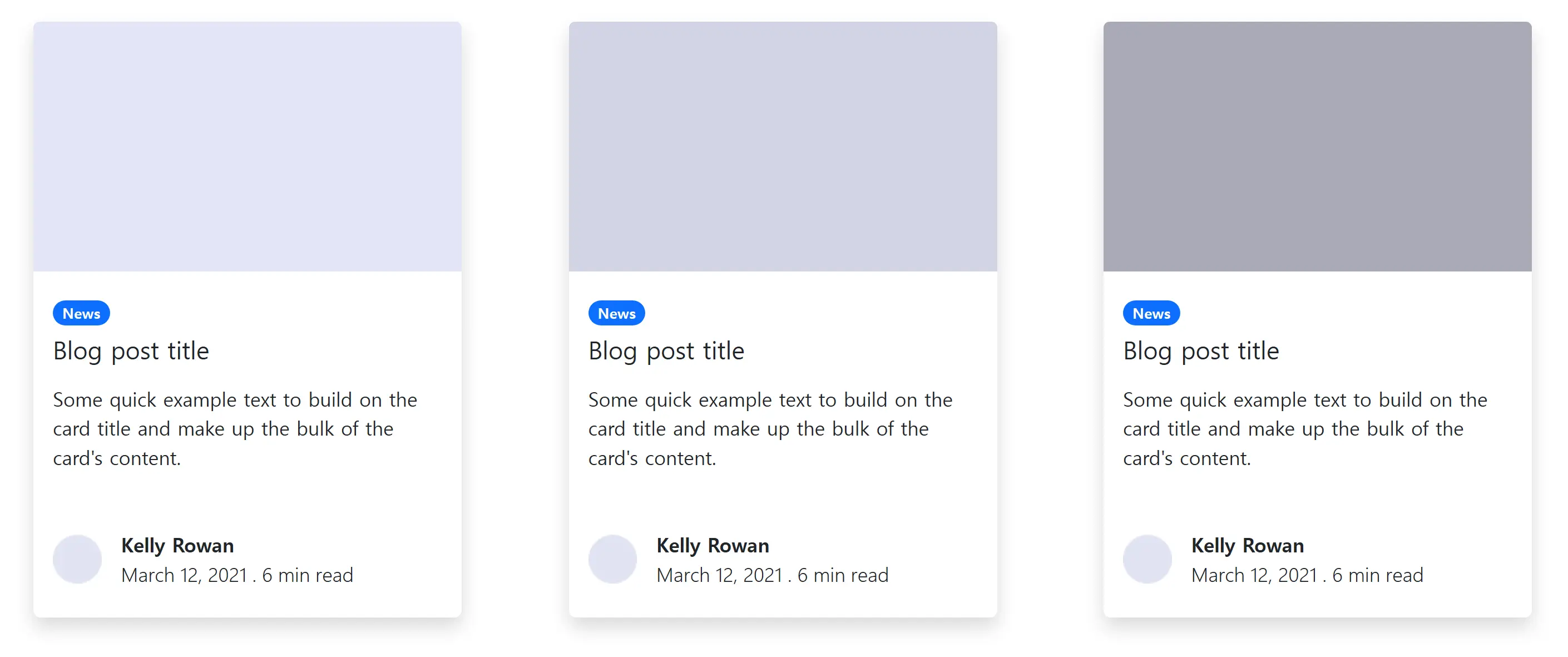
카드 레이아웃(숙제)
- card, badge, shadow, media object 등 사용
- 내 커스텀 css나 style 없이 복붙만 사용
img
index.html1 2 3 4 5 6 7 8 9 10 11 12 13 14 15 16 17 18 19 20 21 22 23 24 25 26 27 28 29 30 31 32 33 34 35 36 37 38 39 40 41 42 43 44 45 46 47 48 49 50 51 52 53 54 55 56 57 58 59 60 61
<div class="container"> <div class="row"> <div class="col"> <div class="card m-4 shadow rounded border-0" style="width: 22rem;"> <img src="img/card1.png" class="card-img-top" alt="1"> <div class="card-body"> <span class="badge rounded-pill text-bg-primary mt-2 mb-2">News</span> <h5 class="card-title">Blog post title</h5> <p class="card-text mt-3 mb-6">Some quick example text to build on the card title and make up the bulk of the card's content.</p> <div class="d-flex align-items-center mt-5 mb-2"> <div class="flex-shrink-0"> <img src="img/mediaobject.png" alt="2"> </div> <div class="flex-grow-1 ms-3"> <p class="fw-bold m-0 ">Kelly Rowan</p> <p class="fw-light m-0">March 12, 2021 . 6 min read</p> </div> </div> </div> </div> </div> <div class="col"> <div class="card m-4 shadow rounded border-0" style="width: 22rem;"> <img src="img/card2.png" class="card-img-top" alt="1"> <div class="card-body"> <span class="badge rounded-pill text-bg-primary mt-2 mb-2">News</span> <h5 class="card-title">Blog post title</h5> <p class="card-text mt-3 mb-6">Some quick example text to build on the card title and make up the bulk of the card's content.</p> <div class="d-flex align-items-center mt-5 mb-2"> <div class="flex-shrink-0"> <img src="img/mediaobject.png" alt="2"> </div> <div class="flex-grow-1 ms-3"> <p class="fw-bold m-0 ">Kelly Rowan</p> <p class="fw-light m-0">March 12, 2021 . 6 min read</p> </div> </div> </div> </div> </div> <div class="col"> <div class="card m-4 shadow rounded border-0" style="width: 22rem;"> <img src="img/card3.png" class="card-img-top" alt="1"> <div class="card-body"> <span class="badge rounded-pill text-bg-primary mt-2 mb-2">News</span> <h5 class="card-title">Blog post title</h5> <p class="card-text mt-3 mb-6">Some quick example text to build on the card title and make up the bulk of the card's content.</p> <div class="d-flex align-items-center mt-5 mb-2"> <div class="flex-shrink-0"> <img src="img/mediaobject.png" alt="2"> </div> <div class="flex-grow-1 ms-3"> <p class="fw-bold m-0 ">Kelly Rowan</p> <p class="fw-light m-0">March 12, 2021 . 6 min read</p> </div> </div> </div> </div> </div> </div> </div>
class="text-muted"로 글씨 회색 처리 가능
Bootstrap Grid 레이아웃
- 반응형 레이아웃 만들 때 편리한 Bootstrap
- 기본 레이아웃
1
2
3
4
5
6
7
8
9
10
11
12
13
  <div class="container text-center">
      <div class="row">
          <div class="col">
          Column
          </div>
          <div class="col">
          Column
          </div>
          <div class="col">
          Column
          </div>
      </div>
  </div>
row: 박스들을 균일하게 쪼개줌. 특히 내부를 12개로 쪼갬col-n: n에 한 박스가 차지할 개수를 넣음.col-6이면 반반씩 차지.- 반응형 레이아웃 ⟶ 조건문 적용
md는 md이상에서만 col-6이라는 뜻- Bootstrap에서 Grid system 검색 (md: 768px)
- Order class : order-first 부착해 박스의 순서 재배치
카드 반응형 레이아웃(숙제1)
- PC 4열, 태블릿 2열, 모바일 1열
index.html1 2 3 4 5 6 7 8 9 10 11 12 13 14 15 16 17 18 19 20 21 22 23 24 25 26 27 28 29 30 31 32 33 34 35 36 37 38 39 40
<div class="container"> <div class="row"> <div class="col-lg-3 col-md-6"> <div class="card m-4" style="width: 13rem;"> <img src="img/photo1.jpg" class="card-img-top" alt="1"> <div class="card-body"> <h5 class="card-title">Card title</h5> <p class="card-text">Some quick example text to build on the card title and make up the bulk of the card's content.</p> </div> </div> </div> <div class="col-lg-3 col-md-6"> <div class="card m-4" style="width: 13rem;"> <img src="img/photo1.jpg" class="card-img-top" alt="1"> <div class="card-body"> <h5 class="card-title">Card title</h5> <p class="card-text">Some quick example text to build on the card title and make up the bulk of the card's content.</p> </div> </div> </div> <div class="col-lg-3 col-md-6"> <div class="card m-4" style="width: 13rem;"> <img src="img/photo1.jpg" class="card-img-top" alt="1"> <div class="card-body"> <h5 class="card-title">Card title</h5> <p class="card-text">Some quick example text to build on the card title and make up the bulk of the card's content.</p> </div> </div> </div> <div class="col-lg-3 col-md-6"> <div class="card m-4" style="width: 13rem;"> <img src="img/photo1.jpg" class="card-img-top" alt="1"> <div class="card-body"> <h5 class="card-title">Card title</h5> <p class="card-text">Some quick example text to build on the card title and make up the bulk of the card's content.</p> </div> </div> </div> </div> </div>
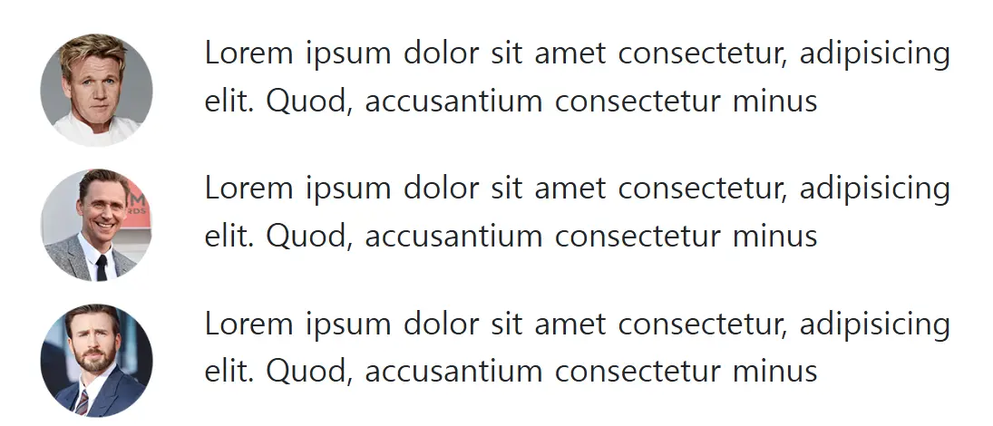
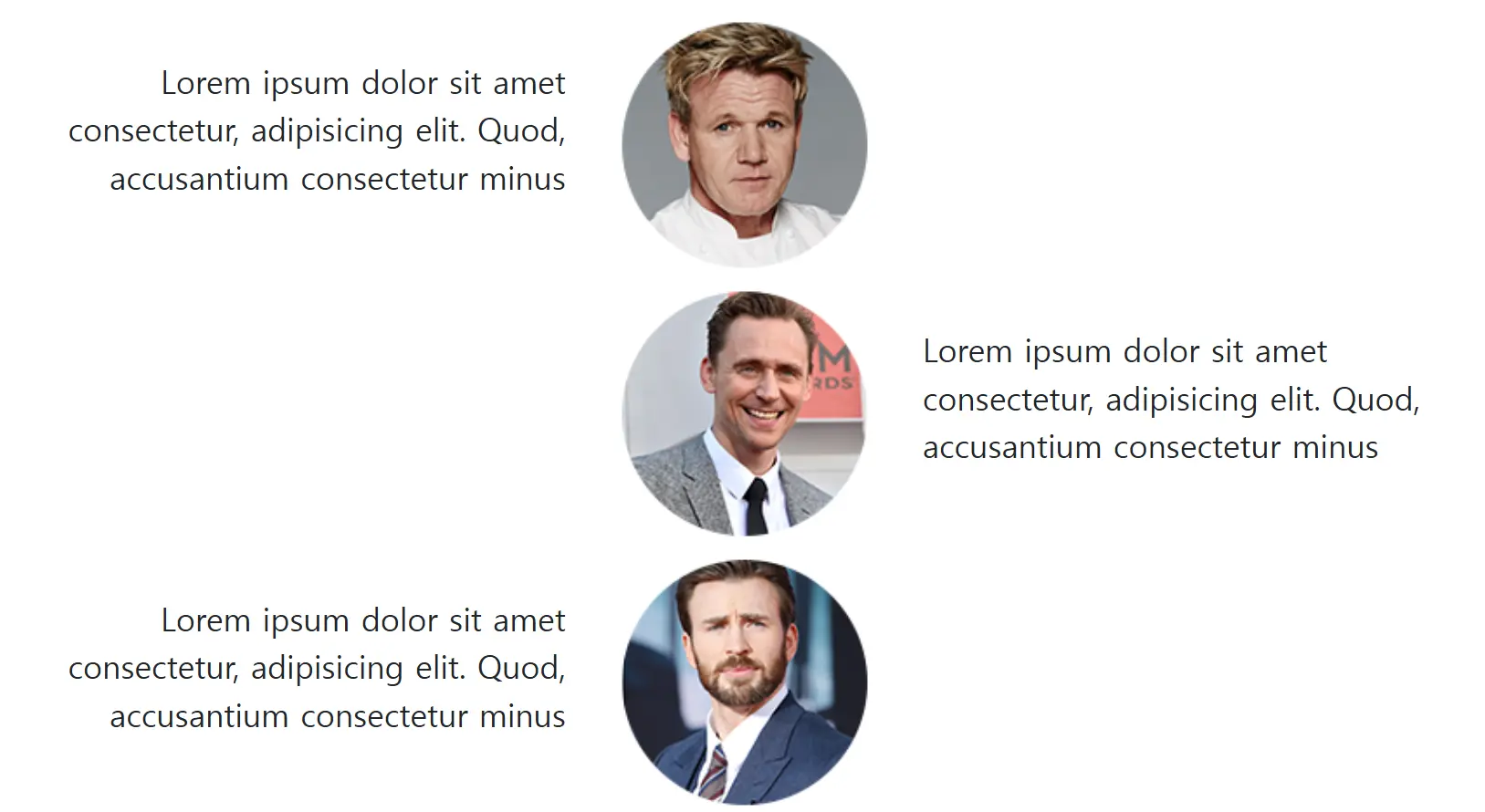
타임라인 반응형 레이아웃(숙제2)
- Bootstrap 이용할 땐 모바일 레이아웃 먼저 만들면 쉽다
img1: mobile
img2: pc
index.html1 2 3 4 5 6 7 8 9 10 11 12 13 14 15 16 17 18 19 20 21 22 23 24 25 26 27 28 29 30 31 32
<div class="container"> <div class="row align-items-center m-1"> <div class="col-2"> <img src="img/author.png" class="card-img-top" alt="1"> </div> <div class="col-10 col-lg-5 order-lg-first text-lg-end"> <p>Lorem ipsum dolor sit amet consectetur, adipisicing elit. Quod, accusantium consectetur minus</p> </div> <div class="col-lg-5"> </div> </div> <div class="row align-items-center m-1"> <div class="col-2"> <img src="img/author2.png" class="card-img-top" alt="1"> </div> <div class="col-10 col-lg-5"> <p>Lorem ipsum dolor sit amet consectetur, adipisicing elit. Quod, accusantium consectetur minus</p> </div> <div class="col-lg-5 order-lg-first"> </div> </div> <div class="row align-items-center m-1"> <div class="col-2"> <img src="img/author3.png" class="card-img-top" alt="1"> </div> <div class="col-10 col-lg-5 order-lg-first text-lg-end"> <p>Lorem ipsum dolor sit amet consectetur, adipisicing elit. Quod, accusantium consectetur minus</p> </div> <div class="col-lg-5"> </div> </div> </div>
CSS 덮어쓰기 잘하는 법 & 어떤 코드가 좋은 코드인가요
- CSS 원본을 수정할 수 없을 때 덮어쓰기
- 같은 클래스명으로 하단에 쓰기(같은 class면 더 밑에 있는 게 우선적용)
- 한 파일 내에서 하단에 쓰기
- 2번째 css파일을 본래 css파일보다 밑에 첨부
- 우선순위 높이기:
class<id<style=""<!important(비추) - specificity 높이기
- 셀렉터가 길어질수록 점수가 높아짐
- 같은 클래스명으로 하단에 쓰기(같은 class면 더 밑에 있는 게 우선적용)
bootstrap 사용되어 있는 경우는 class 추가하는 게 우선적 (덮어쓰기 X)
- 좋은 코드의 원칙
- 나중에 수정/관리가 쉬우면 항상 좋은 코드
- 확장성이 좋은 코드 (재활용 가능한지, 확장해서 다른 class 만들기 쉬운지)
This post is licensed under CC BY 4.0 by the author.